
Scenario: The Promo Spike Trap in Catalog Analytics
Imagine you're the analytics lead for an apparel retailer. Every time a new seasonal catalog launches, your cohort reports show wild spikes in customer purchases and retention—but a closer look reveals these spikes closely overlap with major promotional periods (think Summer Sales, Black Friday, Prime Day). How do you get to the real, actionable metrics that drive catalog planning, product assortment, and CRM? If you've ever struggled to separate genuine seasonal performance from promo-driven noise, this guide is for you.
Difficulty: Intermediate (solid Excel or Python skills recommended, but stepwise approaches for both) Estimated time: 2-4 hours for first deployment, 30-60 minutes ongoing Prerequisites: Access to transactional data, catalog/promo schedules, basic analytics toolkit (Excel, Python/pandas, BI tool)
Why Standard Cohort Analysis Fails in Retail with Promos
Traditional cohort analysis helps benchmark customer retention, lifetime value (LTV), and order patterns by joining customers into groups (cohorts) based on their first event (like first purchase in a season).
But in retail/eCommerce, sales spikes often align with promotions rather than organic catalog success. If you ignore this:
- Cohort results overstate true performance
- Retention curves warp (promo buyers drop off fast)
- LTV is inflated, muddling inventory and marketing decisions
In 2025, with rising promo budgets and year-round deals, normalizing for promo impact is not a luxury—it's essential for honest analytics. As confirmed by industry benchmarks such as the Simon-Kucher Guide to Measuring Promotional Effectiveness (2025), promo-driven anomalies can skew key metrics by 13–25% or more in fashion and consumer goods.
Step-by-Step: Building a Reliable, Promo-Normalized Cohort Analysis
Step 1: Checklist—Prep Your Data and Promo Mapping
Your must-have fields:
- Customer ID
- Transaction date
- Purchase amount
- Product/catalog/seasonal tag
- Promo flag (yes/no or promo name)
- Any price overrides or discounts
Promo periods: Compile start and end dates for all catalog-aligned promotions (e.g., 2025-01-01 to 2025-01-31). Validate these windows against your marketing calendar. Missing promos are the #1 cause of mis-normalization.
Best practice: Build a lookup table (Excel or Python dict) that maps every transaction to its promo status.
Quick Python promo flag example:
import pandas as pd
promo_periods = [
    ('2025-01-01', '2025-01-31'),
    ('2025-06-01', '2025-06-30'),
]
data['promo_flag'] = False
for start, end in promo_periods:
    mask = (data['date'] >= start) & (data['date'] <= end)
    data.loc[mask, 'promo_flag'] = True
Excel users: Add a promo date flag with IF and AND logic or VLOOKUP to tag rows by promo periods.
Step 2: Basic Cohort Analysis (Before Normalization)
Assign cohorts: Customers are grouped by their first purchase date in the catalog cycle (monthly, weekly, seasonally). For example, everyone who made their first purchase in January 2025 is a cohort.
Calculate retention/LTV: Make cohort tables (rows: cohort, columns: months since first purchase; values: repeat rate, revenue, or average order value).
Reality check: These curves almost always surge during promo-driven periods. Don’t trust unadjusted results if promotions intersect your catalog launches.
Step 3: Normalize Cohorts for Promo Impact
Method 1: Excel—Simple Promo Uplift Adjustment
-
Estimate promo uplift: Use non-promo periods to build a "baseline". Calculate the average revenue, retention, or orders in baseline windows.
-
Promo uplift calculation:
Promo Uplift % = (Promo Period Revenue - Baseline Revenue) / Baseline Revenue -
Normalize all affected metrics:
Normalized Revenue = Original Revenue / (1 + Promo Uplift %) -
Apply this adjustment to all cohort table cells that fall in promo windows.
Example:
| Cohort | Month 0 (Promo) | Month 1 | Month 2 |
|---|---|---|---|
| Jan-2025 | $80 → $60 | $22 | $19 |
Here, promo uplift was +33%, so Month 0 revenue is divided by 1.33, yielding a true baseline ($60 instead of $80).
Method 2: Python/Pandas—Regression and Time Series Normalization
A. Regression:
Include promo_flag and season as variables in regression.
from sklearn.linear_model import LinearRegression
X = data[['promo_flag', 'seasonal_tag']]
y = data['amount']
model = LinearRegression()
model.fit(X, y)
promo_effect = model.coef_[0]
Use the regression coefficient for promo_flag to subtract promo-driven uplift from any metric.
B. SARIMA/Time-Series (Advanced): Model retention/revenue with promo flag as an exogenous regressor.
from statsmodels.tsa.statespace.sarimax import SARIMAX
y = cohort_series # e.g., monthly LTV
model = SARIMAX(y, order=(1,1,1), seasonal_order=(1,1,1,12), exog=data['promo_flag'])
results = model.fit()
The promo_flag effect lets you forecast what retention/LTV curves would look like without promotions, as explained in the Atlan Guide to Data Analysis Methods (2025).
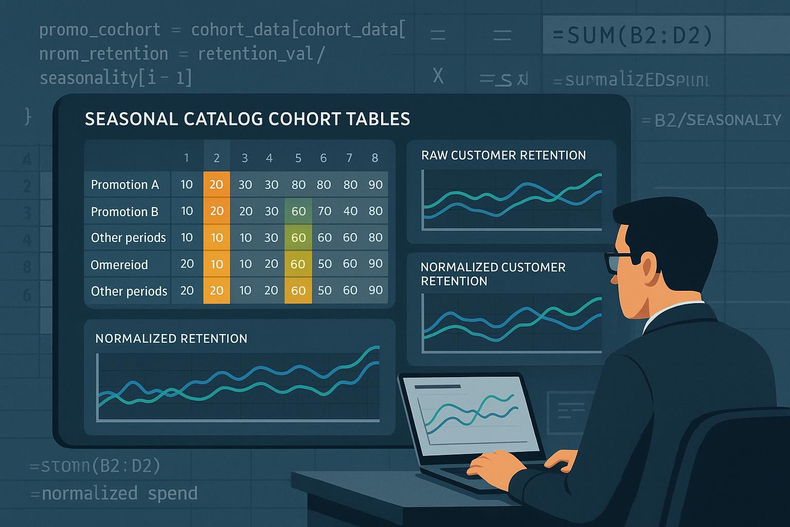
Step 4: Visualizing and Validating Normalized Cohorts
- Chart retention, repeat rate, and LTV curves before and after normalization.
- "+Anomaly" spikes should flatten; genuine seasonal curves emerge.
- Segment charts by cohort and promo status for clear executive reporting.
Verification tips:
- Compare normalized results to a control group not exposed to promos
- Retention should not swing wildly unless seasonality demands it
- Double-check promo flags and baseline definitions—errors here undermine everything
Step 5: Real-World Insights and Action—Turning Normalized Cohort Data into Decisions
After normalization:
- Retention and LTV reflect real catalog or assortment power
- Use clean metrics to optimize re-engagement campaigns
- Stock inventory to match true seasonality (not artificial promo peaks)
- Plan next catalog and promo timing based on accurate cohort "stickiness"
Industry benchmarks: In 2025, major platforms (Amazon, Shopify) observed that adjusting for promo periods changed retention/LTV estimates by up to 15% (see RedStag: Amazon AOV & Promo Trends).
Common Errors and Troubleshooting
Typical mistakes:
- Missing promo flags: Always cross-reference your data with campaign calendars
- Over-correction: Don't adjust out genuine seasonal effects; only normalize promo anomalies
- Short datasets or mismatched baselines: Use rolling windows or extend baselines when catalog cycles are irregular (see details in the Drivetrain.ai Behavioral Analytics Brief (2025))
- Promo overlap: For complex overlapping promos, use regression or machine learning methods to separate effects
Troubleshooting box:
- "If normalized retention drops below baseline, check for missed promo spikes or incorrect promo uplift estimation"
- "If retention stays high in off-promo windows, review cohort assignment logic"
Tool Paths and Resources
Excel:
- IF/AND for promo flagging
- Pivot tables for cohort analysis
- Manual uplift normalization formulas
Python/pandas:
- Automated flagging, regression, SARIMA, charting
- Downloadable code samples and tutorials at leading analytics blogs
BI Platforms & SaaS:
- Many BI tools (Tableau, Power BI, Amplitude, Mixpanel) allow for date-based promo flagging in cohort dashboards
- Some (Klaviyo, WebEngage) have built-in cohort tables; always verify how they treat promo periods
Further reading and template downloads:
- Amplitude: Step-by-step Cohort Analysis & Churn Guide (2025)
- Abrar Muhtasim – Retail Cohort Analysis with Excel/BigQuery/Looker
- WebEngage: Pocket Guide to Cohort Analysis
Key Takeaways & Next Steps
- Promo normalization is vital for actionable retail cohort insights; most off-the-shelf analyses miss this critical step
- Use checklists, code, and tool workflows matched to your team’s skill level
- Always visualize "before and after"—and consult stakeholders before changing benchmarks
- Industry best practices, as surfaced by Simon-Kucher and Drivetrain.ai, demand promo normalization for catalog-driven success in 2025.
Need downloadable templates? Most analysts start in Excel or Python—check competitor links above, or reach out to retail analytics community Slack groups for sample datasets and workflow advice.
You’re now equipped to take control of your seasonal catalog cohort data, strip out the promo noise, and deliver insights that genuinely grow your business—replacing myth with measurable impact.